Opening finding
SkepticalScience.com and Dana Nuccitelli lost their credibility when they chose a politically motivated attack on Lindzen as a skeptic, and doubled down several times.
The 1989 prediction and the 1990s temperature
There was no 1989 Lindzen temperature prediction. The attack treated him as a failed forecaster anyway. The 1990s record is real, and it does not test the sentence they later turned into a curve. The graphic, the comment replies, and the Guardian column each repeated the same claim.
What was said in 1989
On 27 September 1989, Eugene Mallove’s MIT Tech Talk covered a lecture Richard Lindzen had just given to about 250 scientists. Lindzen was talking about the record already in hand. He rejected a claimed warming of about half a degree, plus or minus 0.2, over the previous century.
The entire record would more likely be saying that the rise is 0.1 degree plus or minus 0.3 degree.
Richard Lindzen, reported by Eugene F. Mallove, MIT Tech Talk, 27 September 1989.
His reasons were measurement problems: the Atlantic represented by four island stations, urban corrections as large as the effect being sought, and a record not collected uniformly before 1880. He called the half-degree claim a false use of science. What the data showed, he said, might be a rise, but it sat inside the noise.
I personally feel that the likelihood over the next century of greenhouse warming reaching magnitudes comparable to natural variability seems small.
The only forward-looking sentence in that report.
That is a judgment. It names no rate, no scenario, and no year. In the same talk he said the models were already post-predicting one to two degrees since the nineteenth century, only marginally compatible with the measurements, and that the ocean can store heat and release it even if the Sun and the absorbing gases are fixed. None of that is an anomaly for 1990, 1995, or 1998.
What was drawn and called a prediction
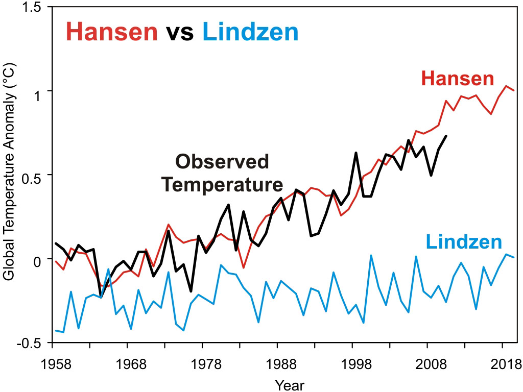
On 29 April 2011 Dana Nuccitelli, writing as dana1981 at Skeptical Science, took the 0.1°C historical remark and treated it as the entire greenhouse signal from 1880 to 1989. From that he computed a sensitivity of about 0.3°C per doubling of CO₂. He then drew a line from an 1880 GISTEMP baseline of −0.3°C, added random noise of about 0.4°C, and extended a trend of roughly 0.01 to 0.02°C per decade.
The post says Lindzen had never made a specific global temperature projection, and that the curves were Nuccitelli’s interpretation, not Lindzen’s. The graphic that traveled dropped that sentence. Its caption calls the blue line a reconstructed temperature prediction by Lindzen.
What the 1990s temperature did
The decade was not a smooth ramp. It was a volcanic dip, a recovery, and an El Niño spike on top of a slower rise. Those are the swings Lindzen had just said were large enough to matter.
1989
The talk
Mallove reports Lindzen on the record already in hand. No anomaly is given for any later year.
1991
Pinatubo
The June eruption cools the global surface by a few tenths of a degree. Some analyses put the peak drop near half a degree.
1995
Recovery
NASA GISS describes 1995 as a return to the pre-Pinatubo level. The volcanic dip has largely faded.
1998
El Niño
GISS reports 1998 as the warmest instrumental year to that date, about 0.2°C above the previous record year, 1995.
GISS also said the 1998 El Niño could not by itself explain the longer warming, and that 1999 would be cooler than 1998 but still warm against the 1951–1980 baseline. A near-zero forced line with white noise is not a description of that decade.
Hansen’s 1988 forecast is the one that can be scored
Hansen and colleagues published three trace-gas scenarios in 1988, run from 1958. Scenario A continued exponential growth. Scenario B slowed it. Scenario C had the net forcing stop rising after 2000. The paper’s own test was that greenhouse warming should be clearly identifiable in the 1990s. On 23 June 1988 Hansen told the Senate that Scenario A was business as usual.
Gavin Schmidt later compared the 1984–2017 trends. Observed warming landed between B and C, nearer C, and well below A.
Skeptical Science’s own 2011 accounting said Scenario B since 1984 ran about 0.26°C per decade against an observed 0.20, roughly 30 percent high, and that an adjusted Scenario B was still about 17 percent high. The public graphic then lowered the red line toward later emissions and toward a 3°C sensitivity. The blue line was not corrected the same way. Presumably that was political: an attack on Lindzen’s character because he is a skeptic. They hate real skeptics, the name SkepticalScience on the website notwithstanding.
Why the 1990s do not vindicate the blue line
Once the constructed series is anchored about half a degree too low in 1989, any real warming in the 1990s — the recovery from Pinatubo, then 1998 — makes the gap wider. Most of that gap is the baseline error. It is not evidence that Lindzen predicted a flat line through a volcanic dip and an El Niño spike. He did not publish the line.
A near-zero forced trend will miss a rising decade by construction. Calling the miss “90 to 95 percent too low” reports the assumption as if it were a result. The decade Hansen marked for a test was the 1990s, and the forecast he published was Scenarios A, B, and C. Through that decade the surface shows a volcano, a rebound, and an El Niño. Over the longer run it tracks below Scenario A and below unadjusted Scenario B.
That is a comparison of a paper with a thermometer. The 1989 “prediction” is a comparison of a thermometer with a curve drawn in 2011.
What the two records look like
This is the work, not the graphic. Hansen published three model runs. Lindzen published a statement about the century already in hand. The black line is the thermometer. Nothing here has been lowered to fit.
This comparison was produced from both studies, from the measured data, and from Hansen’s model runs. It is not a made-up, make-believe graph.
On this file the 1984–2017 trends are 0.33, 0.28, and 0.16 °C per decade for A, B, and C. GISTEMP over those years is 0.20. Extended through 2025, the observed trend from 1984 is 0.23. Still under B, still well under A, still above C. In 2019 the model reads 1.57, 1.10, and 0.61 °C; GISTEMP that year is 0.98, and 2025 is 1.19. The eye at the right edge is not a reason to redraw the blue line.
Today’s GISTEMP rise from the 1880s to the 1980s is about 0.47 °C. That is Hansen’s product as it stands now, not the station set Lindzen was disputing in 1989. His number and this series are different claims about that century. The blue line shows his number, and only through 1989. Lindzen’s paper did not make predictions out to 2018 either. Extending that line is how the fabricated forecast was made.
The poles lab
See also how Hansen’s 1988 predictions of unambiguous warming would appear first in ocean areas near Antarctica and the north pole, high latitudes more than low, from a well-mixed greenhouse forcing were the actual failed prediction.
Arctic and Antarctic ice and temperature vs the 1988 estimates
That desk draws a high-latitude Scenario A line of about 0.70 °C per decade. From 1988 to 2020 the Arctic (NOAA, 60–90°N) rose about 0.68 °C per decade. The Antarctic (60–90°S) changed by about −0.01 °C. The both-poles claim missed the south. A gas mixed through the whole atmosphere does not warm one pole and leave the other flat. The lab reads that split as albedo, ice and cloud, not as a settled radiative-forcing forecast. Models that treat albedo as a small feedback on greenhouse forcing are guessing at the warming. Satellites measure the change in absorbed sunlight as a first-order term.
Sources
- Eugene F. Mallove, “Lindzen critical of global warming prediction,” MIT Tech Talk, 27 September 1989.
- Dana Nuccitelli, “Lindzen Illusion #2,” Skeptical Science, 29 April 2011, and the graphic “Hansen vs Lindzen,” which is the figure above.
- Hansen et al., Journal of Geophysical Research, 1988. Senate testimony, 23 June 1988.
- Gavin Schmidt, “30 years after Hansen’s testimony,” RealClimate, 21 June 2018, for the 1984–2017 trend rates.
- NASA GISS notes on 1995 (return to the pre-Pinatubo level) and on 1998 (record year, about 0.2°C above 1995).